Anyone who knows me can tell you that I am very particular about the photos I post on my blog. So, it pains me to see the "before" photos of my friend's
bachelor pad posted before I have any "after" photos to share. But everyone has been asking for them so I thought I might as well go for it since I have updates to the project to tell you about.
Above is a view of the living room. It's not terrible but it's not great. The walls are a pale sage and the furniture is a mix of mid-century and country. I realized after talking to my friend's step-mother that anything decent in the apartment came from her including the C&B Italia sofa from 1973, the glass and chrome coffee table, and the window blinds. More on her and the fab furniture in a later post! My friend bought the rug and likes it so I'm incorporating it into the design. Of course, I had to get it cleaned and order a rug pad. I slid on the darned thing every time I crossed the room. At one point, I thought I was going to take a header into the coffee table. The walls in the living/office/dining area will be painted Benjamin Moore Collingwood, a pale taupe color.
 The audio/visual wall is also due for an update and will be getting a snazzy new console to hide all the stereo/tv ephemera. The business meeting notes taped to the wall will be getting a very professional looking easel and will be relegated to the "office" area. The kitchen is behind the television wall and boy is it lovely.
 You're lucky I didn't post the photo the showed the hideous florescent light fixture. The institutional yellow is bad enough but then there are those weird curved "wall splashes" (I don't know what else to call them) on each side wall that are killing me. My original plan was to paint the kitchen dark brown a la Ron Marvin, and install mercury glass back splashes but since it's a rental, I didn't want to tear those things off and create a bigger mess. So now the kitchen will be painted Benjamin Moore Dove Wing and I pray that it makes those things less noticeable. We're also taking off the "swinging door" which is completely useless since it runs into the stove which juts out too far. Gotta love it.
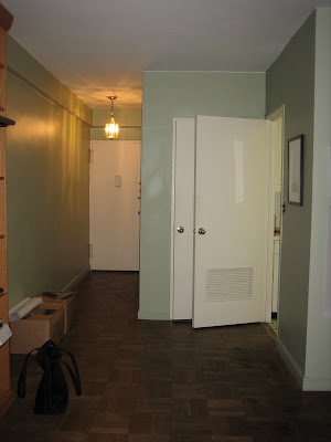
 This is the view to the front door with the other kitchen door open and one of the two entry closet doors visible. There are a lot of doors in this place with not so nice trim so I am planning to just paint the entire entry including the trim and doors Benjamin Moore Middlebury Brown so they hopefully all blend in and disappear. I am also going to take page out of my friend Maison21's rule book and install a dimmer on the entry light. You can never underestimate the power of mood lighting.

This cheap monstrosity of a book case will be one piece of furniture that will not be staying. In it's place will be a large console table topped with a pair of lamps and a mirror to reflect the light from the wall of windows in the living room. I also would like to flank it with a pair of chairs but we'll have to see how far the budget takes us. I practically had to pry the credit card out of my friend's hand today in order to buy the paint so I don't think I'm going to be getting any more money for this job. Oh, did I mention I'm not even getting paid? We'll discuss that later. Moving on...

Are we in a fishing lodge or a New York apartment? Hard to tell huh? All of that is going, needless to say. It's too bad my friend doesn't have a country house. We could relocate everything to it and kill two birds with one stone. I might have to work with the dining table but the pale blue ladder back chairs will be replaced with something more modern. Not sure what yet. The unfortunate light will also be replaced.

As I mentioned earlier, the blinds are actually nice so they are staying. One less thing for me to worry about! Funny there is a bike in the dining room considering all the empty closet space. That and the fact that I can't actually see my friend riding it!

The bedroom isn't that bad actually. We're keeping the wood sleigh bed but replacing the mattress. I've also picked out two vintage bedside tables with drawers. It's hard to tell from this photo but there is a lot of floor space so I'd love to add a pair of chairs by the window and move the brass Cedric Hartman looking reading lamps next to them. I also found a great double dresser with leather handles from Ralph Lauren that I would love to add to the wall across from the foot of the bed but it's $7,000 price tag is a little steep for our budget.
I'm planing to paint the walls Benjamin Moore Horizon, a pale grey blue. The plastering has already begun and the painters are hopefully starting on Tuesday. My friend said his apartment looked like a flop house last night which made me laugh. I think he was a bit naive as to the amount of work that goes into even the smallest design project. But in the end, it will all be worth it. I just hope I get invited over to enjoy all my hard work!
 I hate choosing paint colors. I think it's the hardest part of design. I've had a lot of people email for paint color recommendations and I always tell them that paint looks different in every space and in different light and at different times of the day. It's really a crap shoot and on my bachelor pad gamble I did ok but I wasn't perfect.


 The audio/visual wall is also due for an update and will be getting a snazzy new console to hide all the stereo/tv ephemera. The business meeting notes taped to the wall will be getting a very professional looking easel and will be relegated to the "office" area. The kitchen is behind the television wall and boy is it lovely.
 You're lucky I didn't post the photo the showed the hideous florescent light fixture. The institutional yellow is bad enough but then there are those weird curved "wall splashes" (I don't know what else to call them) on each side wall that are killing me. My original plan was to paint the kitchen dark brown a la Ron Marvin, and install mercury glass back splashes but since it's a rental, I didn't want to tear those things off and create a bigger mess. So now the kitchen will be painted Benjamin Moore Dove Wing and I pray that it makes those things less noticeable. We're also taking off the "swinging door" which is completely useless since it runs into the stove which juts out too far. Gotta love it.
  This is the view to the front door with the other kitchen door open and one of the two entry closet doors visible. There are a lot of doors in this place with not so nice trim so I am planning to just paint the entire entry including the trim and doors Benjamin Moore Middlebury Brown so they hopefully all blend in and disappear. I am also going to take page out of my friend
  This cheap monstrosity of a book case will be one piece of furniture that will not be staying. In it's place will be a large console table topped with a pair of lamps and a mirror to reflect the light from the wall of windows in the living room. I also would like to flank it with a pair of chairs but we'll have to see how far the budget takes us. I practically had to pry the credit card out of my friend's hand today in order to buy the paint so I don't think I'm going to be getting any more money for this job. Oh, did I mention I'm not even getting paid? We'll discuss that later. Moving on...


 John's new line is based on some of his most cherished antiques and even though they are new, they have a wonderful vintage quality to them. But of course, I wouldn't expect anything less than perfection from the man of the hour.


